
Speaking Our Language: Graphic Design Terms
If you’re not a designer, following along with a conversation full of graphic design terms can definitely be a tad overwhelming. Like any other industry-specific jargon, it might sound like another language at first. But once you familiarize yourself with some key terms and phrases, you’ll get the hang of it in no time.
Here’s a quick rundown of some phrases you’ll definitely come across:
Common Graphic Design Terms:
Grid/Grid Lines: When creating a new file (image or project), using a grid format can help structure your content more easily, by establishing consistent margins and evenly spaced columns. Grids keep everything aligned and give balance and structure to the content.
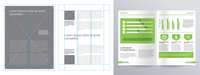
Grid layout via Designers Insights
Kerning: This refers to spacing of individual lettering within a word. It’s an important term to know because if the spacing between characters is too close together or too far apart, it can change the way the word is interpreted or even make it difficult to read.
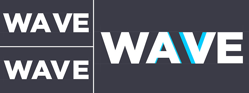
Play the Kerning game, via Method of Action
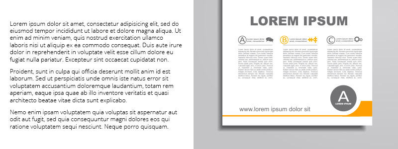
Leading: Somewhat similar to kerning, leading is the vertical spacing between each line of text in a paragraph of copy. If you have a larger chunk of text, increasing the leading can make it easier to read by visually breaking it up.
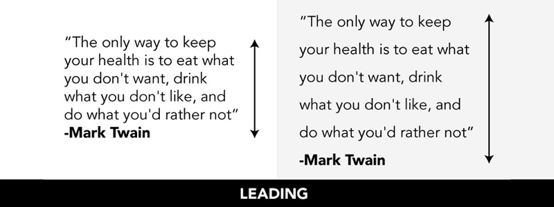
Example via Creative Market
Widow: This is when the last word or short last line of text gets “separated” on its own at the end of a paragraph. From a design perspective, you’ll want to eliminate widows to improve the overall appearance of the content.
Serif vs. Sans Serif: The difference between these typeface styles are the small “tails” at the end of each stroke: serif fonts have them, sans serif fonts do not. Sans serif fonts are perfect for a sleek, modern look, while serif fonts work really well for a more classic look.
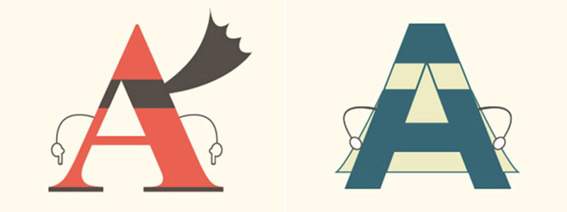
Example via UrbanFonts
Typography: This is the art of using type as a way to communicate. It transforms content from flat text to an engaging, impactful part of the design.
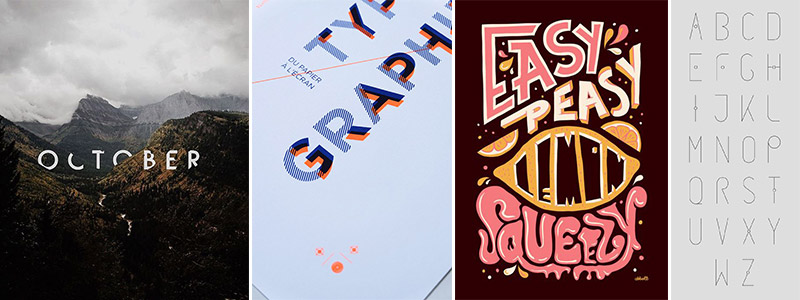
October via Pinterest; Typography via Pinterest; Easy Peasy via Pinterest; Alphabet typography via Pinterest
Lorem Ipsum: This is sometimes referred to as Greek, and it’s used as placeholder text when creating mock-ups to give an idea of what the design will look like when the final content is placed. You can even shake up your mockups with some fun, unexpected filler text provided by this Lorem Ipsum Generator.
Vector: A vector is an outlined image made up of points rather than pixels, so it can be edited any which way and sized up and down infinitely. For example, when you’re using a vector image, you can scale to any size you want and it will keep the same resolution without pixelating.
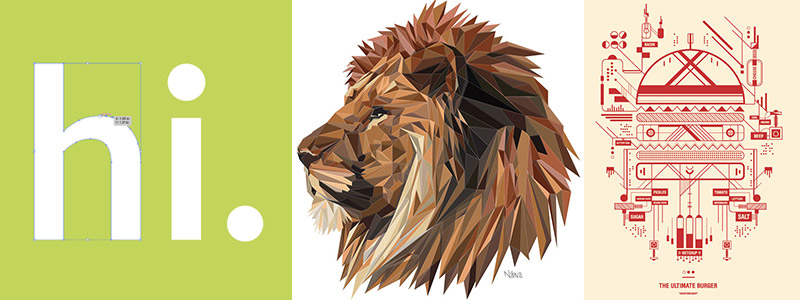
Lion via Behance; The Ultimate Burger via Creative Bloq
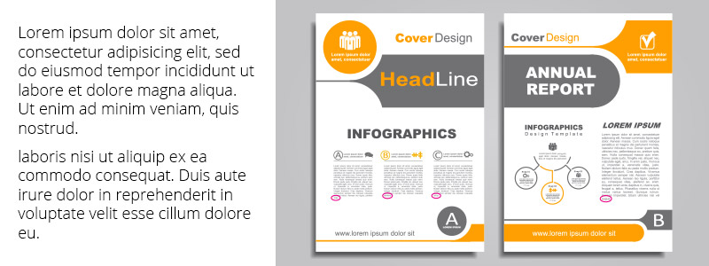
White Space: The negative space that surrounds the elements in your design and gives it balance. Just because there’s technically nothing in it, don’t underestimate the significance of white space. It’s just as important as the rest of the design, because it gives your eye a place to rest. It can even function as its own design element.
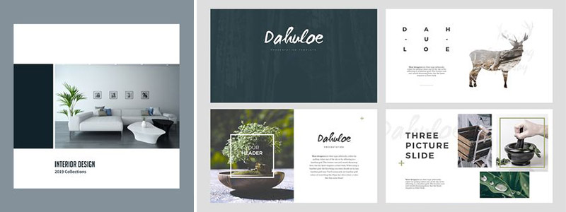
Interior Design brochure via Pinterest; Dahuloe slides via Pinterest
Hierarchy: This refers to manipulating the placement and styling of design elements, such as color, size, and shape, in order to signify importance and direct the viewer’s attention. Some good examples include establishing header and body copy styles for a longer content piece, or a using a grayscale image with certain elements called out in color for emphasis.
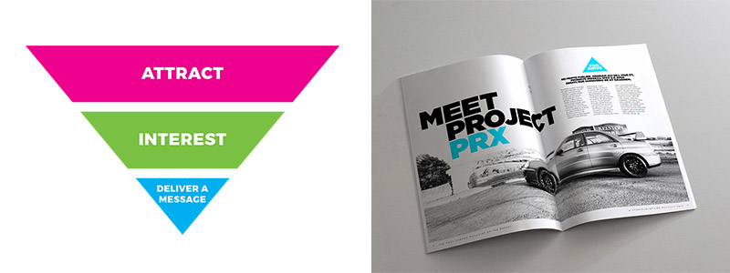
Meet Project PRX via ZevenDesign
Push and Pull: This is a way of giving your design some depth using typography and imagery. You might pair heavy fonts with lighter ones in order to emphasize the key message or visual what you’re trying to communicate. These contrasts make designs feel less static and more visually interesting.
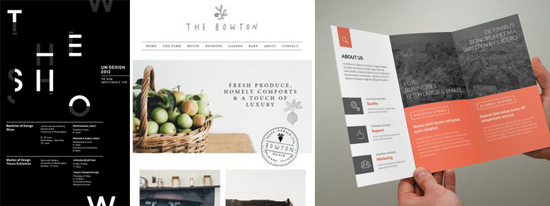
UW Design 2012 via Pinterest; The Bowton via Pinterest, About Us brochure via Pinterest
Bleeds/Crops: Bleed refers to the space you’re willing to trim when a design prints, and the crop is just that: the place where it will be cropped. Using bleeds and crops are beneficial so you don’t have to worry about cutting a print piece right at the edge of a design and misjudging by a hair, leaving a white gap.
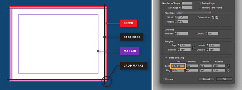
Diagram via Adobe
All Around Creative’s Own Lingo
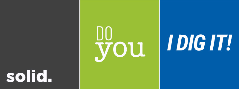
In our own studio, we’ve developed some of our own shorthand. For example, if something is “solid”, that means it’s a successful or impactful design that achieves its purpose. When our Studio Manager Rick says to “do you”, that’s code for us to put our own spin on the project. And an “I DIG IT!” from Rick is highly sought-after; that’s his way of telling us he likes our approach.
We’re happy to help you take a deeper dive into this glossary of graphic design terms, and into the broader world of graphic design—just reach out to us to get started – we think you might just dig it! Need more help? Check out AAC’s work page.


